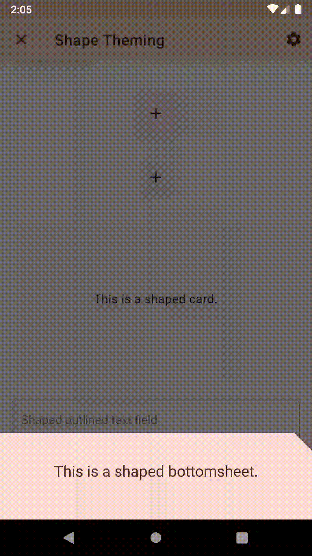
Shape is an important component of Material Design, and the Material Design Components library for Android supports shape theming on many of the Views that it offers. I recently found myself struggling to get my bottom sheets to show rounded corners though. Here’s a guide to getting your bottom sheets shaped properly!
The Material Components library allows us to configure the corners of components such as bottom sheets fairly easily. It also offers more than just rounded corners- you can have cut corners as well! Before we get started, I’d highly recommend checking out the Material docs on shape to learn more about how Material recommends utilizing shape throughout your application.
The first step in creating the right shape for your bottom sheet is to define a shape appearance. This is simply a style that defines what kind of shape we want for our bottom sheet.
A simple rounded corner shape would look something like this:
<style name="ShapeAppearanceOverlay.Demo" parent="">
  <item name="cornerSize">8dp</item>
  <item name="cornerFamily">rounded</item>
  </style>
We could also create a shape with a cut off top left corner like this:
<style name="ShapeAppearanceOverlay.Demo" parent="">
  <item name="cornerSize">0dp</item>
  <item name="cornerFamilyTopLeft">cut</item>
  <item name="cornerSizeTopLeft">16dp</item>
</style>
You can find all the available attributes and more documentation for shapes on the Material Design website
One option for shaping our bottom sheets is to use Material Design’s theme-wide shape categories. All shapeable components fall into one of three categories- small, medium, or large- and each of those categories have their own default shape appearance.
Bottom sheets fall into the “large” bucket, which also includes nav drawers, side sheets, and backdrops. If those components should share the same shape as your bottom sheets, set shapeAppearanceLargeComponent on your theme like so:
<style name="AppTheme" parent="Theme.MaterialComponents.Light.NoActionBar">
  <item name="shapeAppearanceLargeComponent">@style/ShapeAppearanceOverlay.Demo</item>
</style>If you only want to shape your bottom sheet dialogs (both BottomSheetDialog and BottomSheetDialogFragment), you can instead set a bottomSheetDialogTheme and bottomSheetStyle on your app theme:
<style name="AppTheme" parent="Theme.MaterialComponents.Light.NoActionBar">
  <item name="bottomSheetDialogTheme">@style/ThemeOverlay.Demo.BottomSheetDialog</item>
</style>

<style
  name="ThemeOverlay.Demo.BottomSheetDialog"
  parent="@style/ThemeOverlay.MaterialComponents.BottomSheetDialog">
    <item name="bottomSheetStyle">@style/Widget.Demo.BottomSheet</item>
</style>

<style name="Widget.Demo.BottomSheet" parent="Widget.MaterialComponents.BottomSheet">
  <item name="shapeAppearanceOverlay">@style/ShapeAppearanceOverlay.Demo</item>
</style>
Let’s explore these styles a little more:
bottomSheetStyle attribute specifies a style to apply to bottom sheetsbottomSheetDialogTheme attribute specifies a theme for every BottomSheetDialog and BottomSheetDialogFragment in your app.ThemeOverlay.Demo.BottomSheetDialog then defines a bottomSheetStyle attribute, which specifies the style to apply to the bottom sheet. Behind the scenes this is actually applied to a FrameLayout which then gets attached to a BottomSheetBehavior.Widget.Demo.BottomSheet specifies the shapeAppearanceOverlay that defines the shape of our bottom sheets.The use of shapeApperanceOverlay here when the Material Design Components library also defines a shapeAppearance attribute can be confusing! Here’s the difference:
shapeAppearance should be a reference to a theme attribute (generally one of the sizes mentioned above, such as shapeAppearanceLargeComponent)shapeAppearanceOverlay should directly reference a style that overrides the default provided by the shapeAppearance.
In other words, use shapeAppearance if you want to set a widget’s small/medium/large shape bucket, and shapeAppearanceOverlay if you want to override that bucket.We can also shape individual bottom sheets! First we need to define a theme overlay like we did before:
<style
  name="ThemeOverlay.Demo.BottomSheetDialog"
  parent="@style/ThemeOverlay.MaterialComponents.BottomSheetDialog">
    <item name="bottomSheetStyle">@style/Widget.Demo.BottomSheet</item>
</style>

<style name="Widget.Demo.BottomSheet" parent="Widget.MaterialComponents.BottomSheet">
  <item name="shapeAppearanceOverlay">@style/ShapeAppearanceOverlay.Demo</item>
</style>
Then we can wrap our Context with our theme when we create a BottomSheetDialog:
val wrappedContext = ContextThemeWrapper(getContext(), R.style.ThemeOverlay_Demo_BottomSheetDialog))
val dialog = BottomSheetDialog(wrappedContext)
// ...
Or we can set the theme on a BottomSheetDialogFragment:
class DemoBottomSheetDialogFragment: BottomSheetDialogFragment() {
  override fun onCreate(savedInstanceState: Bundle) {
    super.onCreate(savedInstanceState)
    setStyle(DialogFragment.STYLE_NORMAL, R.style.ThemeOverlay_Demo_BottomSheetDialog)
  }
}
Finally, we can apply our style to a persistent bottom sheet:
<FrameLayout
    android:id="@+id/bottom_sheet"
    style="@style/Widget.Demo.BottomSheet"
    android:layout_width="match_parent"
    android:layout_height="400dp"
app:layout_behavior="@string/bottom_sheet_behavior" />There are two more things to watch out for-
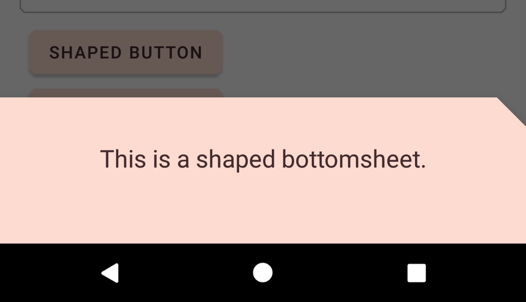
First, be careful with bottom sheets that define their own background. The shape that you define for your bottom sheet is applied to the sheet’s background and the contents are not clipped to that shape. That means that if you define your own background for your dialog, you’ll lose your rounded corners!
Second, be aware that bottom sheets automatically animate their corners from any rounded or cut shape to a square shape when the sheet is fully expanded. You cannot easily disable this behavior. Here’s an example with cut corners: