One of our goals as Android developers should always be to make our our apps as usable as possible. That includes making our apps accessible for users with disabilities or other impairments that require them to use accessibility features such as screen readers to interact with our apps.
As I’ve started playing with Jetpack Compose I’ve been curious about how Compose handles providing information to accessibility services. In this article we are going to dive into how Jetpack Compose interacts with TalkBack. How do we provide content descriptions for images, or attach state labels to elements like checkboxes? We will answer those questions and more!
This is part two in my two-part series on Jetpack Compose’s semantics APIs. Part one of this series provides an introduction to the semantics framework as a whole.
Note: Compose is still in alpha, and these APIs are subject to change. Accessibility in particular is an area in which the Compose team knows they need to do more work before the first stable releases. If you see gaps or notice any bugs, be sure to file a ticket on the issue tracker!
TalkBack is a screen reader, which means that it takes content on the screen and reads it out load to the user. Users tap on elements on the screen or use swipe gestures to move accessibility focus around the screen and TalkBack then reads a description of that element. We will be focusing on TalkBack in this article because it is the most commonly used accessibility service. It is also easy for developers to play around with since it ships with all Android devices!
TalkBack is built on Android’s AccessibilityService APIs. Any app can offer an accessibility service, and there are other services such as BrailleBack (which connects to a Braille display) as well that support users with all manner of accessibility needs. Because of this, the accessibility APIs on Android are not intrinsically tied to TalkBack or even the concept of “read this text out loud”.
What this means to us as application developers is that we never have direct control over what TalkBack reads out loud. We merely offer context and additional information about our UIs to the accessibility framework so that services such as TalkBack can interpret that data and present it in a way that makes sense.
One last interesting thing to note about TalkBack is that it is open source. You can browse the TalkBack source on GitHub. This can be helpful when TalkBack is behaving in an unexpected way and you want to know why.
One of the core challenges for Compose is that after our Composables emit their UI to the screen there is no hierarchical representation of our UI. Accessibility services rely heavily on having that hierarchy in the form of AccessibilityNodeInfo objects.
As we explored in part one of this series, the semantics framework provides the information needed for Compose to create the AccessibilityNodeInfo objects for us. What this post will explore is how Compose maps our semantics to AccessibilityNodeInfo and how TalkBack uses that information.
SemanticsPropertyReceiver defines most of the properties we use to support accessibility.
This isn’t an exhaustive list, but rather a guide to the properties that you are most likely to use.
contentDescription is a direct analogue to android:contentDescription, and it populates AccessibilityNodeInfo.contentDescription.
TalkBack reads this text when your Compose element receives accessibility focus. This is particularly useful for visual content such as images or icon buttons. For example you might want your app bar’s back button to have a contentDescription of “back button”:
IconButton(
    onClick = { },
    icon = { Icon(Icons.Default.ArrowBack) },
    modifier = Modifier.semantics {
      contentDescription = "back button"
    }
)
If you do not set a contentDescription, accessibility services will typically read the text content of your node. In the back button example above, TalkBack would be completely silent without the content description since there is no text associated with the button.
Jetpack Compose Alpha 9 note: This attributed used to be accessibilityLabel, and was renamed in alpha 9.
A very common desire is to group multiple elements on screen together and have TalkBack read them as one element. For example if you have a Checkbox with a Text, you probably want to have both the state of the Checkbox and the text grouped together for accessibility purposes. mergeDescendants enables that grouping! In the android.view world it is common to do this using android:importantForAccessibility on a ViewGroup.
Here’s a concrete example with a Checkbox:
Row(
    Modifier.semantics(mergeDescendants = true) {}
) {
    Checkbox(checked = true, onCheckedChange = null)
    Text("Item one")
}
This will create a Row that is focusable for accessibility, and when it receives focus TalkBack will read “Checked, Item one”.
You might have noticed that I set onCheckedChange = null on the Checkbox(). By default Checkbox() and other clickable elements internally set mergeDescendants, and any Composable that merges it descendents will not be merged into a parent. In other words, Talkback will treat the checkbox as separate from the rest of the row even though you added mergeDescendants to the row! Setting onCheckedChange = null will prevent the checkbox from adding those semantics and will allow it to merge with the rest of the row. Thanks to @erraticqueer for pointing this out!
stateDescription provides information on an elements state. This corresponds to AccessibilityNodeInfo.stateDescription. TalkBack will read the state description before the contentDescription.
For example, the built-in Toggleable Composable adds a stateDescription indicating the checked or unchecked state:
@Composable
fun Toggleable(state: ToggleableState) = composed {
  val semantics = Modifier.semantics(mergeDescendants = true) {
      this.stateDescription = when (state) {
          On -> "Checked"
          Off -> "Unchecked"
          Indeterminate -> "Indeterminate"
      }
}
A basic Checkbox (which is a Toggleable) like this will read “Checked. Sample checkbox”:
Checkbox(
    checked = true,
    onCheckedChange = {},
    modifier = Modifier.semantics {
        contentDescription = "Checkbox"
    }
)
Note - for custom toggleable and selectable components, consider using Modifier.toggleable(), Modifier.triStateToggleable(), or Modifier.selectable(), which provide additional functionality.
Jetpack Compose Alpha 9 note: This attributed used to be accessibilityValue, and was renamed in alpha 9.
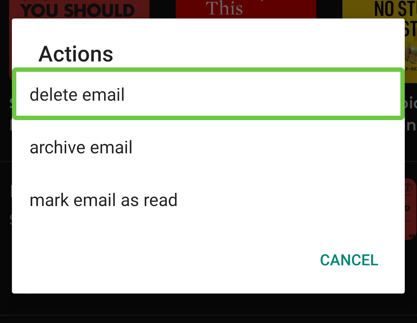
customActions are useful for surfacing actions that are difficult to use or discover. A great example is long clicking- there is nothing about a UI component that would make a long click affordance inherently obvious.
Note that click and long click actions are built into Modifier.clickable(), but you can add your own actions with customActions!
Android shows actions in a dialog triggered by the “show actions” gesture. This includes both custom actions and standard actions such as clicks.
Here’s an example of customActions:
Row(
    modifier = Modifier.semantics {
        customActions = listOf(
            CustomAccessibilityAction("delete email") {},
            CustomAccessibilityAction("archive email") {},
            CustomAccessibilityAction("mark email as read") {},
        )
    }
)
These actions would show up like this:
accessiblityRangeValue describes the range of a node, typically in the context of an element like a Slider.
If I have a custom Composable that displays progress on an achievement, I might want to use this property like so:
Box(
    modifier = Modifier.semantics {
        accessibilityValueRange = AccessibilityRangeInfo(
            current = .5f, // current value within the range

            range = 0f..1f // total available range

        )
        contentDescription = "achievement progress"
    }
)
TalkBack will read this node as “50 percent, achievement progress, progress bar”.
See Modifier.progressSemantics(@FloatRange(0.0, 1.0) progress: Float) for a shortcut when the range is 0f to 1f.
There are two scroll state properties: horizontalAccessibilityScrollState and verticalAccessibilityScrollState. These two properties provide scroll information for accessibility services. I don’t expect many apps to need to explicitly set these directly.
Modifier.horizontalScroll() and Modifier.verticalScroll() enable a Composable to scroll when it is bigger than its max constraints and both set appropriate horizontalAccessibilityScrollState and verticalAccessibilityScrollState semantics.
Calling disabled() in a semantics {} block will set AccessibilityNodeInfo.enabled to false.
TalkBack in turn will not read out any actions on that component. For example, a Button will no longer read out “double tap to activate.”
The hidden() semantics function marks AccessibilityNodeInfo.isVisibleToUser as false.
TalkBack will then ignore this element completely. This is similar to setting android:importantForAccessibility="no".
Modifier.clickable() makes a Composable clickable. It does more than just set up semantics- it also supports features such as ripple indications!
One property that Modifier.clickable() sets is mergeDescendants. This is why all the children of a Button are grouped as a single element in TalkBack! Note if a clickable element has a clickable child (e.g. a Checkbox()), you may want to disable clicking on that child. By default the clickable child will still be clickable independently of the parent.
clickable() also sets up appropriate click actions on the accessibility node. You can provide an onClickLabel to specify what action clicking this item will trigger. By default, TalkBack will read “double tap to activate”, but if you specify an onClickLabel it will read that instead. For example, this would read “double tap to open message”:
Row(
    modifier = Modifier.clickable(
        onClick = {}
        onClickLabel = "open message"
    )
) {
    /* Content here */
}
Similarly, Modifier.toggleable() and Modifier.triStateToggleable() configure Composables to be toggleable with appropriate accessibility support.
Something that surprised me is that in some situations Compose will populate an AccessibilityNodeInfo with a className from the android.view world.
In most cases this is driven by the role semantic property. For example, we can apply a Role.Button to any Composable that behaves like a button. If you are using Modifier.clickable(), Modifier.seletable(), or any other Modifier that provides interaction, make sure you are setting an appropriate role!
There are a cases handled by other semantics as well - for example if you use a Composable that sets [accessibilityRangeInfo], Compose will set a className on the node of either android.widget.SeekBar or android.widget.ProgressBar.
This is an artifact of using the android.view UI framework for ten years. Perhaps unsurprisingly, the accessibility framework and services assume they are working with Views. The View class name is one piece of context these service use to surface information to users.
In a Compose world we don’t have any reasonable “class name” we can use to populate that field on AccessibilityNodeInfo. Compose tries to fill in some of these gaps by pretending our Composables are Views.
It will be interesting to how the accessibility framework and services evolve to support Jetpack Compose in a more natural way. My hunch is that some of the functionality that currently relies on classes will move towards more explicit APIs instead of implicit functionality based on the class.
If you want to dig into how semantic properties map to fields on AccessibilityNodeInfo, check out the source for AndroidComposeViewAccessibilityDelegateCompat