Caution
This post is out of date. Compose UI 1.8.0 (released in April 2025) brought signifcant improvements to autofill, replacing most of the APIs described here. You can read about those changes here.
Autofill is one of my favorite features to come to Android in recent years. I never want to manually type in my address and credit card information again. Autofill makes filling out forms an absolute breeze!
With Jetpack Compose on the horizon I’ve been seeing a lot of questions around how to support autofill in Jetpack Compose. Yes, autofill is supported in Compose, and here’s how you use it!
Warning: Google intends to simplify interaction with the Autofill framework by supporting an autofill Modifier in the future. Since Compose is currently in beta with a goal of maintaining API stability, it is unlikely to change prior to a stable 1.0 release. Keep an eye out for it though!
The first thing we need to add autofill support to a Composable is an AutofillNode.
An AutofillNode needs three things:
AutofillType)onFill callback that will be called when the user selects an autofill suggestionRect with the coordinates of the Composable in the windowOne big difference from the View autofill APIs is that Compose’s AutofillType is an enum, not a string. You could technically set any string as an android:autofillHint on a View, but autofill services tend to use a standardized set of hint constants. Compose using an enum of those constants instead of a string is a big win to help ensure consistency.
The bounding Rect of our Composable is fairly easy to get. We can use a Modifier.onGloballyPositioned().
A complete AutofillNode will look like this:
AutofillNode(
  autofillTypes = listOf(AutofillType.EmailAddress),
  onFill = { /* update the email */ }
)
TextField(
  modifier = Modifier.onGloballyPositioned {
    autofillNode.boundingBox = it.boundsInWindow()
  }
)
Once we have our AutofillNode we need to add it to the AutofillTree, which we can access via LocalAutofillTree.
LocalAutofillTree.current += autofillNode
The last thing we need is to actually trigger the autofill action. We do this by grabbing the local Autofill instance and calling requestAutofillForNode(AutofillNode). Usually you will want to do this when your component receives input focus with Modifier.onFocusChanged().
A complete Composable that supports autofill for an email address looks like this:
@Composable
fun AutofillEmail() {
  var email by remember { mutableStateOf("") }
  val autofillNode = AutofillNode(
    autofillTypes = listOf(AutofillType.EmailAddress),
    onFill = { email = it }
  )
  val autofill = LocalAutofill.current

  LocalAutofillTree.current += autofillNode

  OutlinedTextField(
    modifier = Modifier.onGloballyPositioned {
      autofillNode.boundingBox = it.boundsInWindow()
    }.onFocusChanged { focusState ->
      autofill?.run {
        if (focusState.isFocused) {
          requestAutofillForNode(autofillNode)
        } else {
          cancelAutofillForNode(autofillNode)
        }
      }
    },
    value = email,
    onValueChange = { email = it }
  )
}
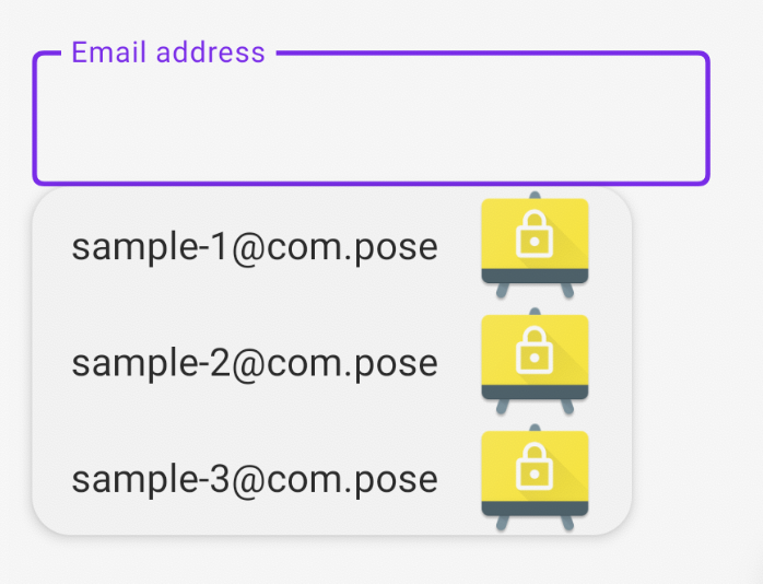
Here’s what it looks like in action:

One thing I love about Compose’s approach is that it makes manipulating the autofilled data extremely easy. You can perform any sort of mapping or formatting of the input data in the onFill callback. Way easier than subclassing a View and overriding the autofill() method!
That’s a lot of code to get autofill working for a single Composable. We can make our lives a bit easier by extracting a lot of that behavior.
The ExplicitAutofillTypesDemo gives us a good place to start by offering an Autofill composable that you can use to wrap any component. I think we can do even better. I mentioned that Google is planning on supporting autofill via a Modifier, so let’s try to create that!
The trickiest part is that we need to access our LocalAutofill and LocalAutofillTree in the Modifier. Modifier.composed() gives us that ability- it’s lambda is a @Composable!
fun Modifier.autofill(
  autofillTypes: List<AutofillType>,
  onFill: ((String) -> Unit),
) = composed {
  val autofill = LocalAutofill.current
  val autofillNode = AutofillNode(onFill = onFill, autofillTypes = autofillTypes)
  LocalAutofillTree.current += autofillNode

  this.onGloballyPositioned {
    autofillNode.boundingBox = it.boundsInWindow()
  }.onFocusChanged { focusState ->
    autofill?.run {
      if (focusState.isFocused) {
        requestAutofillForNode(autofillNode)
      } else {
        cancelAutofillForNode(autofillNode)
      }
    }
  }
}
Now our text field composable is simple and clean, and we can reuse the Modifier anywhere:
@Composable
fun AutofillEmail() {
  var email by remember { mutableStateOf("") }

  OutlinedTextField(
    modifier = Modifier.autofill(
      autofillTypes = listOf(AutofillType.EmailAddress),
      onFill = { email = it },
    ),
    value = email,
    onValueChange = { email = it }
  )
}
While this modifier works pretty well there are two things our Autofill Composable doesn’t do yet that we do get with Views.
First, Views typically show a light yellow background after being autofilled:

This happens automatically for Views such as EditText, but doesn’t for any Composables. If you want this behavior, you could easily reproduce it by applying a Modifier.background() after an onFill callback:
var wasAutofilled by remember { mutableStateOf(false) }
var email by remember { mutableStateOf("") }

OutlinedTextField(
  modifier = Modifier.background(if (wasAutofilled) Color(0xFFFFFDE7) else Color.Transparent)
    .autofill(
      autofillTypes = listOf(AutofillType.EmailAddress),
      onFill = {
        email = it
        wasAutofilled = true
    },
    value = email,
    onValueChange = {
      email = it
      wasAutofilled = false
    }
  )
)
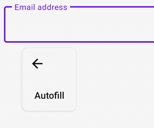
The second thing that our Composable doesn’t support yet is the Autofill action in the context menu. This is shown when long-pressing on an EditText:

Compose doesn’t currently adding options to a text field’s context menu, so this isn’t possible right now. That support is mentioned on the issue tracker though, so watch for updates!