In 2021 I wrote a bit about Jetpack Compose’s support for autofill. At the time the APIs were pretty clunky to use. Back then you needed to wrap your composable in an AutofillNode, manually add it to a autofill node tree, and manage updating your text field’s state yourself.
Compose UI 1.8.0 introduces new autofill APIs that address many of these shortcomings. The new APIs are more concise and make it easier to support autofill with Jetpack Compose.
Autofill configuration is now offered through Compose’s semantics framework. All you need to do is set a contentType semantic property!
For example, add ContentType.EmailAddress to configure a TextField to autofill email addresses:
var email by rememberTextFieldState()
TextField(
    email = email,
    modifier = Modifier.semantics { contentType = ContentType.EmailAddress }
)
Easy!
You can also declare that a text field can accept multiple types of autofilled content. If you support authentication via an email address or a phone number you can allow autofilling both:
Modifier.semantics {
  contentType = ContentType.EmailAddress + ContentType.PhoneNumber
}
If you are using the TextField variants that take in a value you can use onValueChange to manipulate the inserted text.
You could, for example, convert the input text to uppercase:
  TextField(
    value = emailAddress,
    onValueChange = { emailAddress = it.uppercase() },
    modifier = modifier.semantics { contentType = ContentType.EmailAddress },
  )
If you are using TextFieldState you can use TextField’s new inputTransformation and outputTransformation APIs:
Or uppercase-ing TextField would look something like this:
  TextField(
    state = emailState,
    modifier = modifier.semantics { contentType = ContentType.EmailAddress },

    // Swap this for an `inputTransformation` to uppercase the actual state
    // This only visually shows uppercase
    outputTransformation = OutputTransformation {
      replace(0, length, toString().uppercase())
    }
  )
One shortcoming I noted in my original blog post was that Compose autofill didn’t highlight inputs automatically. Autofill with Views set a yellow background to inform users that a field was autofilled. The new Compose autofill does this! Well, sometimes.
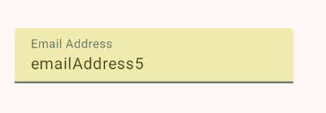
This works out-of-the-box if you use the TextField with the state: TextFieldState overload. It should work for the value overloads as well but there is a bug and the highlight draws behind the field. Update: this bug has been fixed in AOSP and should be available in a new Material release soon!
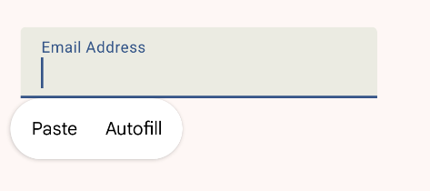
The old implementation didn’t support showing an “autofill” option in the context menu. It does now! This allows users to manually trigger autofill when needed.
You can use these autofill semantics with other types of inputs too!
Say you want a switch that automatically checks itself if an email address starts with an “E”. You can do this by using the onAutofillText semantic property to get a callback when autofill provides you with text:
var firstLetterE by remember { mutableStateOf(false) }
Switch(
  modifier = Modifier.semantics {
    contentType = ContentType.EmailAddress

    // We need to declare a data type explicitly since this isn't a TextField
    contentDataType = ContentDataType.Text

    onAutofillText { text ->
      firstLetterE = text.startsWith("E", ignoreCase = true)
      true
    }
  },
  checked = firstLetterE,
  onCheckedChange =  { firstLetterE = it },
)
This may seem like a silly feature (it is), but this technique can also power auto-fillable dropdowns or radio boxes for birthdates, genders, or other fields.
The are also other ContentDataTypes available for lists, toggles, and dates, but those are not yet implemented.
Compose 1.8.0’s new autofill APIs are a big improvement for developers. Autofilling fields now requires significantly less code and offers more functionality. Compose is close to have feature parity with the View framework now!
If you want to learn more about Autofill in Compose, I also recommend checking out the official documentation which includes additional tips such as how to manually save new autofill data.